Welcome The First Live Plagiarism Map
We are proud to present you a Live Plagiarism Map. For the very first time, anyone can view, interact and see actual live statistical information about the occurrence of plagiarism around the globe.
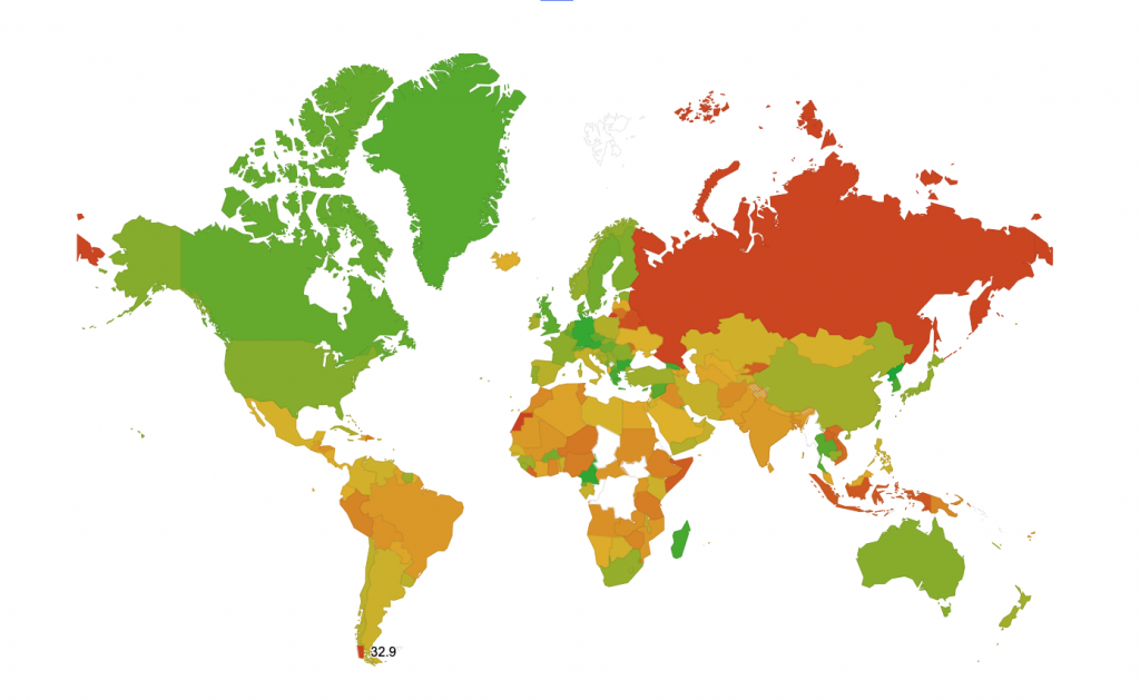
The map is colour-coded, so you, at first glance, will be able to see in which countries plagiarism is most-prevalent as well as where it is still growing. Green tones indicate a “purer” content with less plagiarism, yellow tones – middle of the pack, red ones – a significant spread of plagiarism.
What data is included in the Live Plagiarism Map
The Live Plagiarism Map is created by evaluating the last 5 million documents which were uploaded to the service from around the world. Most of the documents are study papers and research papers.
The map has tools to help everyone navigate through and analyse the information at hand. For our clients to have the ability to view and get a grasp of the content of the map is very simple. Even if you are viewing the map for the first time, you will notice that Russians tend to plagiarise 2.5 times more than Americans. Interested what is going on with your country? Scroll over and get your most up-to-date answer within seconds.
Live Map
Our plagiarism map is “live”, meaning that it is continuously being updated with the most recent and up-to-date statistics. Our robots regularly gather data from users, monitor other statistical databases and compile it here, for every user to see. Scroll the mouse on your country to see whether copycats have a safer haven here or in the neighbouring country.
Global tool for global problem
“We seek to raise awareness on plagiarism globally. By enabling people, not just our users, but people in general with the right tools to know more about plagiarism, Oxsic wishes to improve insights and related decisions in every member of our society. Dependable, used globally, impactful globally – these are the qualities we strive for.” said the founder of Oxsic when commenting on the introduction of the map to the public.
The map is free, so every user can access it, analyse and share the data with others, enlighten themselves and share that knowledge with others. The information is gathered in more than 130 languages, so almost all the world is involved in the statistical analysis carried out by our team.


I’m looking through the data and was wondering how you get information from places like Bouvet, Antarctica and Minor Outlying Islands?
Hello, John,
there is no information collected from these locations due to low/no user activity there.
Wow this great!
Ill be using this map in my lecture about research integrity & plagiarism.
Thanks a lot
Very useful plagiarism map. Thank you very much.